
My Role: Product Designer | Duration: 4 days | Platform: App | Tools: Figma
Weverse Home Redesign
Overview
While exploring Weverse, the home screen felt functional but lacked clear hierarchy and visual depth, making it less polished and guided than expected. This redesign improves structure, engagement, and overall refinement.
Current Experience

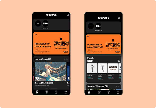
Here, In the current Home of Weverse we see following design flaws:
-
Weak visual hierarchy → unclear entry point
-
Merch (high engagement) placed too low
-
Limited cues for horizontal interactions
-
Flat UI reduces visual distinction between sections
Objective
-
Establish a clear top-down hierarchy
-
Surface important content earlier
-
Improve scanability and flow
-
Add subtle visual depth without changing the brand identity
Design Changes
1. Visual Depth
Added a subtle gradient background to reduce flatness and create separation between sections.
2. Content Emphasis
Increased the size of the artist name (“ENHYPEN”) to strengthen identity and make the header more prominent.
3. Merch Prioritization
Moved the Merch section above Weverse DM to improve visibility and reduce scroll dependency.
4. Interaction Cue
Added a right-arrow indicator in the Merch section to signal horizontal scrolling.
5. Layout Refinement
Adjusted spacing and alignment to create clearer grouping and improve scanability.
6. Brand Retention
Kept original colors and overall style, focusing only on structural and visual refinement.
Redesigned Experience
%20Weverse%20home.jpg)
Before & After: Weverse Home
.jpg)
Current Home
Redesigned Home
Usability Testing
I conducted a quick usability test with a small group of users by showing both the original and redesigned home screens.
Method
-
5 users who engage with Weverse more than twice a week were selected for the study.
-
Shown both versions side by side
-
Questions Asked:
-
Which screen is easier to scan?
-
Which feels more organized?
-
Which interface do you prefer?
-
Result
4 out of 5 users preferred the redesigned interface, citing clearer structure and easier content scanning. 1 user showed no strong preference.

Impact
The redesign improves content visibility and creates a clearer entry point for users. Key sections are easier to identify, and the overall experience feels more structured without changing the core product.